
When you take a deep breath, it’s good to know what you’re breathing in. If living in the wildfire West has taught me anything, it’s that you can’t always rely on your nose to know how clean the air is. On really bad Air Quality Index (AQI) days, we see and smell smoke, but the AQI can still be unhealthy even if the air seems clear.
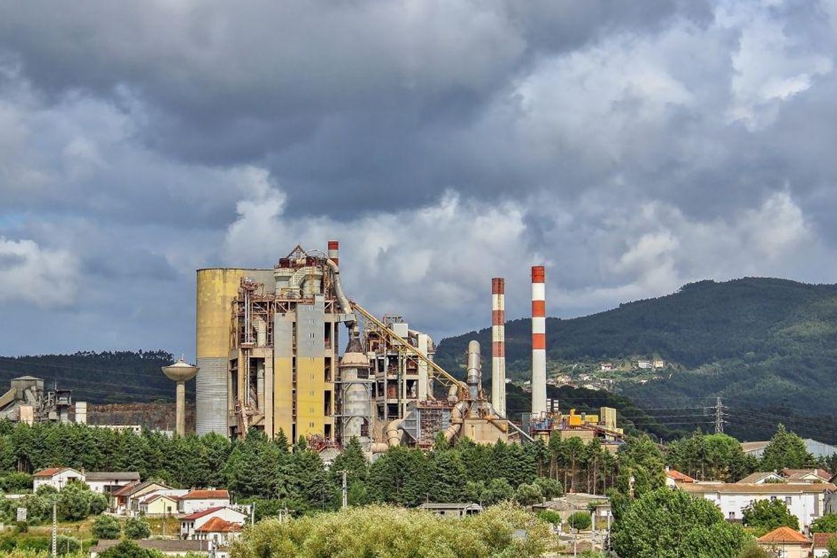
A new ProPublica analysis of data from the Environmental Protection Agency (EPA) shows that some of us may be living in places with toxic air pollution from industrial chemicals and not know it. Air polluted with hazardous chemicals can cause various kinds of cancer, but until now it wasn’t simple to see what your own household risk was.
With ProPublica’s interactive, neighborhood-level map, now you can.
And you might want to—especially if you live in Texas, which apparently has a quarter of the 20 hot spots with the highest excess cancer risk. Nothing like getting rid of those pesky environmental regulations, eh?
As explained in ProPublica’s article about the first-of-its-kind map:
“At the map’s intimate scale, it’s possible to see up close how a massive chemical plant near a high school in Port Neches, Texas, laces the air with benzene, an aromatic gas that can cause leukemia. Or how a manufacturing facility in New Castle, Delaware, for years blanketed a day care playground with ethylene oxide, a highly toxic chemical that can lead to lymphoma and breast cancer. Our analysis found that ethylene oxide is the biggest contributor to excess industrial cancer risk from air pollutants nationwide. Corporations across the United States, but especially in Texas and Louisiana, manufacture the colorless, odorless gas, which lingers in the air for months and is highly mutagenic, meaning it can alter DNA.”
Yeah. Not great.
Also not great is how people of color are more affected by toxic air pollution. ProPublica shared these statistics: “Census tracts where the majority of residents are people of color experience about 40% more cancer-causing industrial air pollution on average than tracts where the residents are mostly white. In predominantly Black census tracts, the estimated cancer risk from toxic air pollution is more than double that of majority-white tracts.”
After reviewing the map, Wayne Davis, an environmental scientist formerly with the EPA’s Office of Chemical Safety and Pollution Prevention, told ProPublica, “The public is going to learn that EPA allows a hell of a lot of pollution to occur that the public does not think is occurring.”
Most people’s air is within a safe range, but there are certain hot spots near industrial plants where cancer risk is many times higher than what the EPA deems acceptable. The EPA examines air pollution from certain types of facilities and industries in isolation, not taking into consideration how hazardous air might compound in a cluster of hot spots and put the people living near them at much higher risk.
Matthew Tejada, director of the EPA’s Office of Environmental Justice, told ProPublica it would take “working back through 50 years of environmental regulation in the United States, and unpacking and untying a whole series of knots” to address these high-risk hot spots.
The whole ProPublica report, which you can find here, is worth a read. You can access the interactive map here. (Scroll down a bit to find the bar to enter your city, zip code or street address.)