
This article originally appeared on 03.03.17
Jill Pelto’s world is made up a rich blues, ochres, and a sky that looks like something out of an old mariner’s chart.
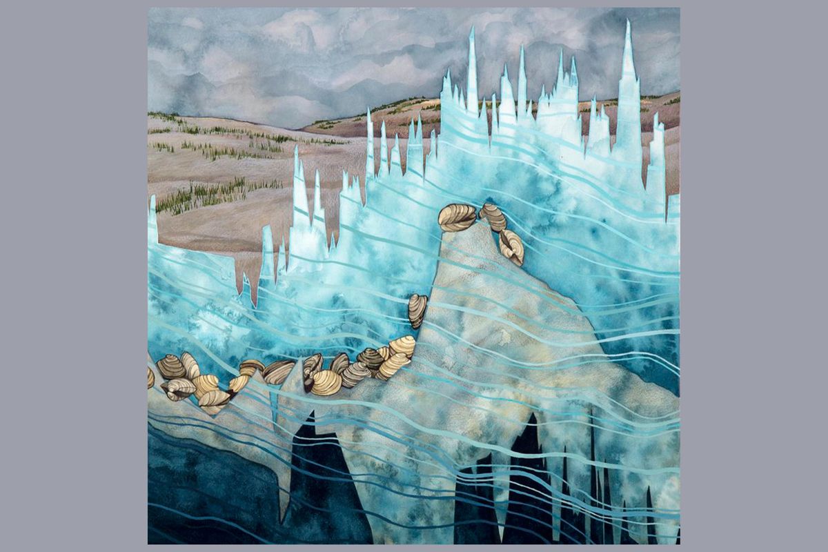
But when you start to look closer, little details start to pop out. You notice a number here or there. Or a series of points marching down the top of a glacier. Or … is that an x-axis?
Wait, are all of these charts?! This is data! Wooah!
The artwork, you see, isn’t just beautiful. While each piece starts as a simple line graph of mass or temperature, Pelto — a graduate student at the University of Maine — transforms them into something more.
Pelto has spent the past years creating this astounding series of paintings, all based on scientific data.
She was first inspired by a research trip back in 2015.
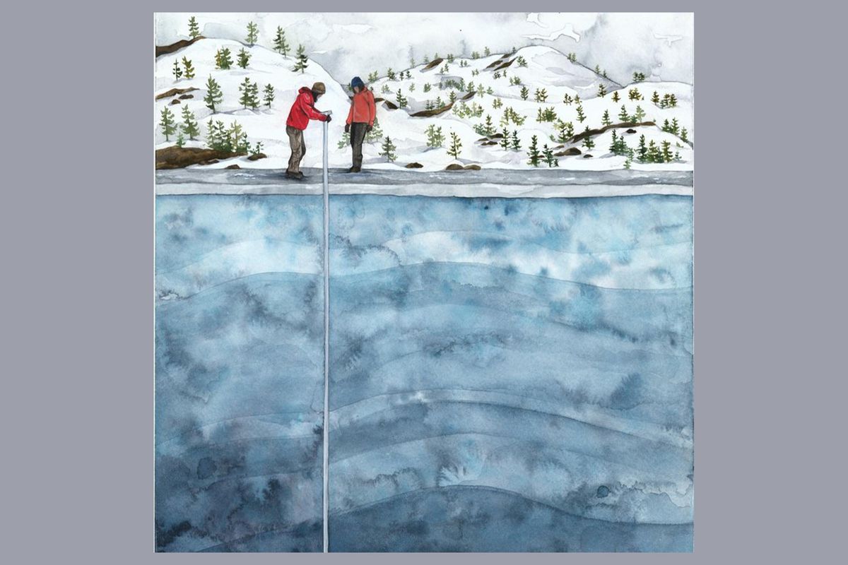
Since she was 16, Pelto’s been going on research trips with her father, glaciologist Mauri Pelto. In 2015, she joined her father in the field to study the glaciers in Washington state’s North Cascade National Park.
On the trip, Pelto saw how the glaciers, while beautiful, had also lost much of their mass. Inspired, saddened, and packing her watercolors, Pelto decided to try to use her art to communicate what she was seeing.
The mass of glaciers in the North Cascades from 1980 to 2014. Data available here.
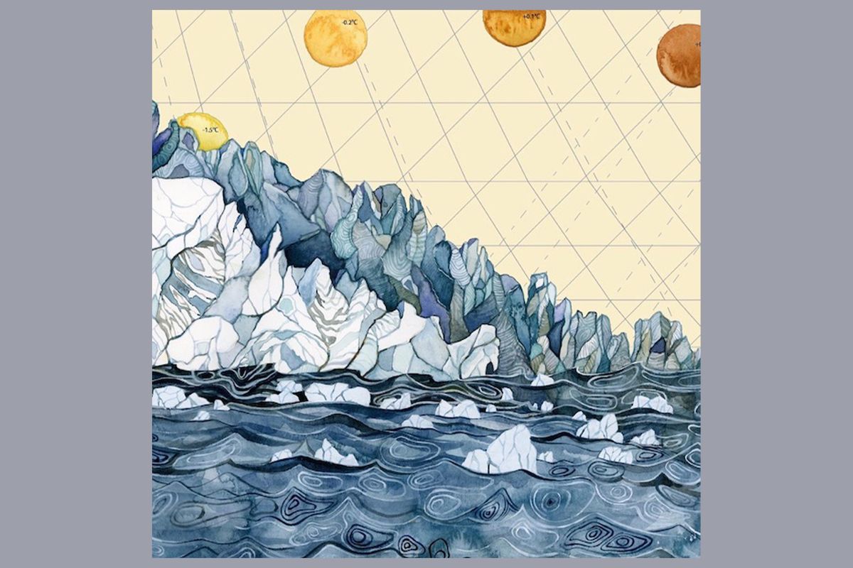
Since then, Pelto has continued the project, turning not just glacial mass but many other variables into brilliant works of art.
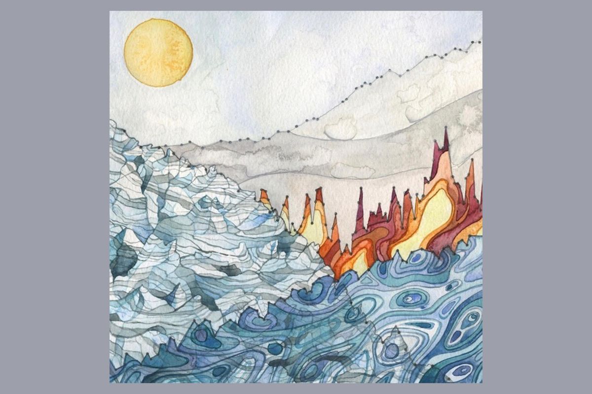
Within the deep purples and reds of a forest on fire hides a global temperatures trend.
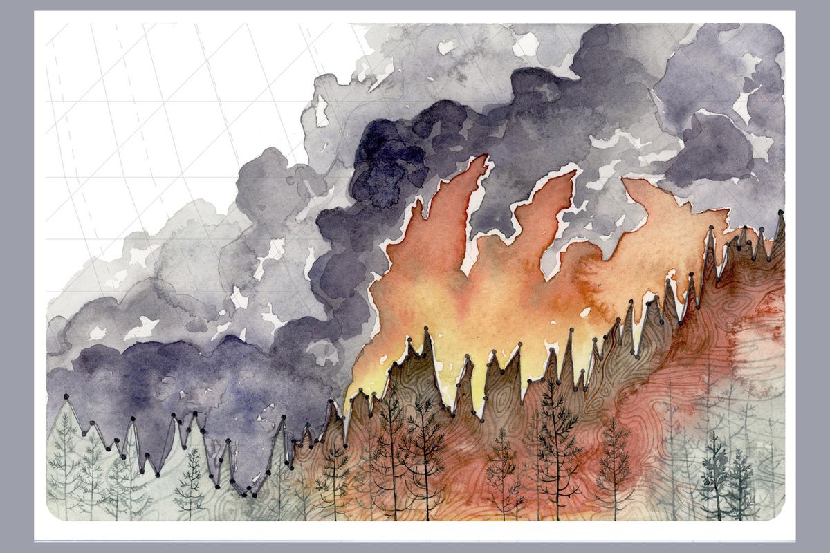
Global temperature data, obtained from Climate Central, becomes the backdrop to an incredible forest fire. Rising temperatures and drought conditions could increase the future risk of forest fires.
Aquamarine-colored salmon intertwine with waves made from their population numbers.
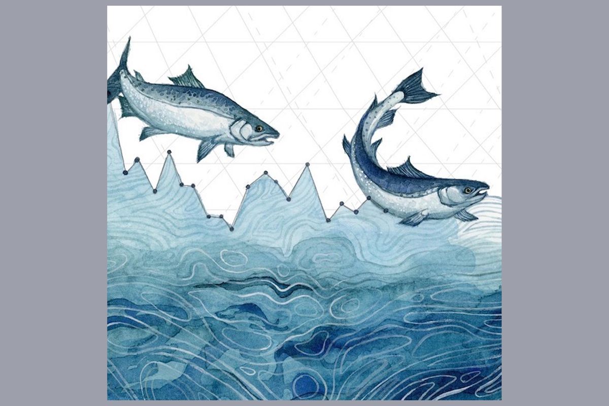
Washington state has been hit by a number of droughts in the last few decades. Many rivers run low, affecting the coho salmon that spawn there.
Lifelike Arctic foxes hide amid a line graph that shows dwindling ice sheets.
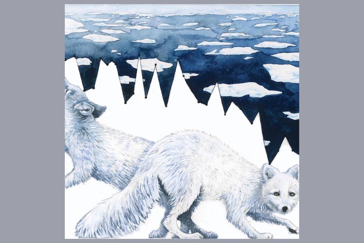
The graph tracks the loss of Arctic sea ice from 1980 to the present. Arctic foxes are well-equipped to survive the chilly polar weather, but as the poles get warmer, larger species may invade and outcompete them.
This beautiful swaying reef exists in an increasingly acidic ocean.
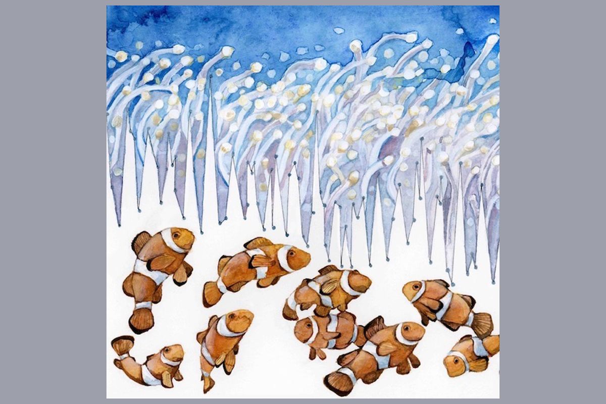
As more carbon dioxide is pumped into the atmosphere, the ocean is slowly becoming more acidic. Many species could be affected, including clownfish.
A tiger struggles against it’s shrinking jungle habitat.
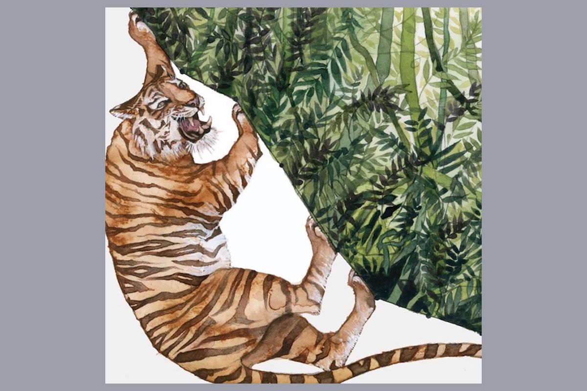
This line graph is based on the decline in tiger habit area from 1970 to 2010.
Here, four different trends combine into a complex, ethereal landscape.
In this piece, called “Landscape of Change,” Pelto combined data on sea levels, glacial decline, temperatures, and fossil fuel usage.
Pelto plans to continue painting once she completes her master’s degree.
Science is an important tool for understanding our changing world, but even the most passionate scientist will admit it can be pretty dry at times. Getting people excited about trend lines or statistical analyses is no easy feat.
But art touches us on an emotional level. We get art. Seeing something that can combine the two disciplines, and hopefully inspire something inside us, is pretty dang cool.
You can see more of Pelto’s artwork at her website.