
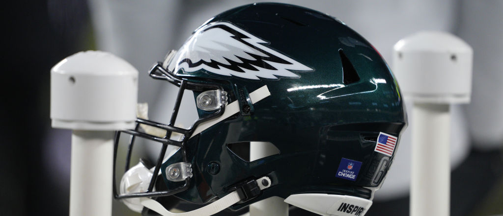
The Philadelphia Eagles are one of the most interesting teams in the NFL as we approach the start of the 2022 season. The team went 9-8 and earned a Wild Card spot in the NFC last year behind a 6-1 stretch towards the end of the year. With second-year head coach Nick Sirianni, another year of development for Jalen Hurts, the acquisition of AJ Brown at wide receiver alongside DeVonta Smith, and a defense that added a pair of standouts from last year’s indomitable Georgia Bulldogs team in the Draft, Philly looks like a team that could make the postseason for the fifth time in six years.
And they will try to do that with a new wordmark for their logo that freakin’ stinks. The team announced the news on Thursday that they stripped away the design that made the word “EAGLES” look like an eagle. Instead, they went in a more modern (read: worse) direction by taking the word “EAGLES,” italicizing it, and then … I dunno it looks like they tried to cut a slice of pizza out of both of the E’s.
The #Eagles have tweaked the wordmark for their logo, going with a more modern look. pic.twitter.com/raqORA9dvm
— Ari Meirov (@MySportsUpdate) June 16, 2022
The good news is that, per Shamus Clancy of Philly Voice, it “should not replace the ‘Eagles head’ brand mark, which will continue to serve as the team’s primary logo.” The bad news is that any striving for a sleek, modern design in a rebrand has fallen to 0-for-every time. Maybe next time!